Main content
This is the main content. This is the main content.
Lab 2 - Cascading Style SheetsStyling with the STYLE attributeStyle attribute allows configuring look and feel right on the element. Although it's very convenient it is considered bad practice and you should avoid using the style attribute. CSS SelectorsID selectorsInstead of changing the look and feel of all the elements of the same name, e.g., P, we can refer to a specific element by its ID. Here's another paragraph using a different ID and a different look and feel. Class selectorsInstead of using IDs to refer to elements, you can use an element's CLASS attribute. This heading has same style as paragraph above.Document structure selectorsSelectors can be combined to refer elements in particular places in the document. This paragraph's red background is referenced as ColorsForeground colorThe text in this paragraph is red but this text is green Background colorThis background of this paragraph is red but the background of this text is green and the foreground white BordersSolid fat red border Dashed thin blue border PaddingPadded top left Padded bottom right Padded all around MarginsMargin bottom Margin left right Margin all around Rounded cornersRounded corners on the top Rounded corners at the bottom Rounded corners all around Different rounded corners DimensionPortrait Landscape Square RelativePortrait Landscape Square Absolute positionPortrait Landscape Square Fixed positionCheckout the blue square that says "Fixed position" stuck all the way on the right and half way down the page. It doesn't scroll with the rest of the page. Its position is "Fixed".Fixed position Z indexPortrait Landscape Square FloatYellow Blue Red Grid layoutLeft halfRight halfLeft thirdRight two thirdsMain contentThis is the main content. This is the main content. FlexBasic rowColumn 1 Column 2 Column 3 Flex growColumn 1 Column 2 Column 3 Fixed width + flexColumn 1 Column 2 Column 3 All columns grow equallyColumn 1 Column 2 Column 3 Proportional relative growthColumn 1 Column 2 Column 3 Media Query DemoThis demo uses CSS media queries to change colors based on screen width:
React Icons SamplerTailwind ExercisesContinue with the Tailwind section here: Lab 2 Tailwind BootstrapGrid systemLeft halfRight halfOne thirdTwo thirdsSidebarMain contentSidebarResponsive grid systemColumn AColumn BColumn CColumn DResponsive grid system123456789101112Tables
Responsive tables
Favorite moviesAliens Terminator Blade Runner Lord of the Ring Star Wars FormsDropdownsSwitchesRangeAddons$0.00 $0.00 Responsive formsResponsive forms 2Cards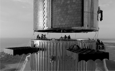 Stacking Starship Stacking the most powerful rocket in history. Mars or bust! XS - Extra Small (<576px) S - Small (≥576px) M - Medium (≥768px) L - Large (≥992px) XL - Extra Large (≥1200px) XXL - Extra Extra Large (≥1400px) | |||||||||||||||||||||||||||||||||||||||||||||||||||